Designing the Brolly website


My Role: Product Design | Creative Director

As a fast moving startup Brolly is growing rapidly in terms of features and product offerings. A recurrent theme in our user feedback was that the users didn’t understand Brolly’s value proposition, or what Brolly does. This led to large team-wide discussions and brainstorming where we decided we needed to tackle this across both platforms, beginning with one of our earliest user touchpoints: the website.
PROJECT GOAL

The goal of this project is to determine the best approach and design for our website in order to create an experience where the user is clear on the following:

  • What Brolly offers
  • Our value to them
  • An understanding of how the app works
  • A clear path to achieve their goals
  • APPROACH

    Design Process

    Whilst working within the fast-paced startup environment, I focused on using a collaborative, user-centered and iterative process to take this project from ideation, to design and development. Team collaboration and collaborative design were critical not just in the early stages of idea generation but also alignment of the vision and decision making. I used user data (from Mixpanel), user feedback (collated from a variety of sources) and ongoing feedback to help craft our new experience.

    DISCOVER

    Desk Research

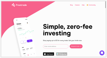
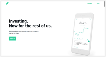
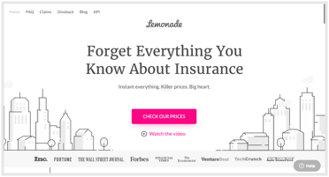
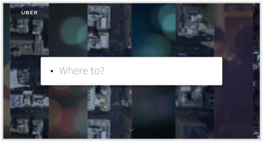
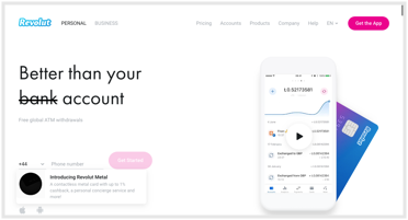
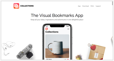
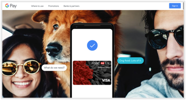
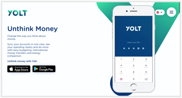
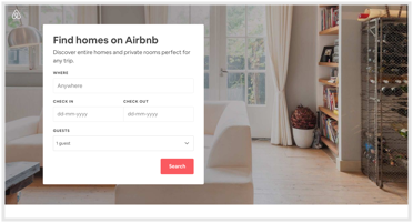
    Working alongside other key stakeholders (the CEO and Product Engineer), I compiled a selection of interesting websites so we could dissect how they’ve solved their particular UX/UI scenarios and potentially incorporate into our designs. We then reconvened and reviewed the various websites. We discussed what we liked and disliked and any ideas generated from these. I used a shared Google Doc to document any interesting visual patterns I'd seen and as a document to review when we reconvened.

    Screenshot
    Screenshot
    Screenshot
    Screenshot
    Screenshot
    Screenshot
    Screenshot
    Screenshot
    Screenshot

    DISCOVER

    Competitor Analysis

    Some competitor analysis was conducted with both companies directly related to Brolly’s business model as well as indirect competitors, I looked at information structure, layout, tone and navigation. Below are some key findings:

    Wrisk

  • Clear hero text on landing page shows value proposition quickly and easily digestible
  • Product images on hero not the clearest
  • GIFs on features section adds interactivity
  • Sosure

  • Hero section although aesthetically pleasing, not immediately clear on value
  • Multiple different UI patterns and can be hard to follow, lack of colour variabilty doesn't call attention
  • Coverage section (iPhone in the center) works well and is clear
  • Cuvva

  • Clear header and CTA on hero section
  • Social proof immediately viewable on landing (reviews, regulation, chat)
  • Would benefit from better usage of white space
  • DISCOVER

    Interviews & Conversations

    In addition to the desk research, stakeholder interviews and impromptu chats were facilitated with core team members in order to get a better sense of individual stakeholder desires, concerns, goals, understanding and attitudes towards the redesign. These conversations helped to surface insights that we could incorporate into the design work and help facilitate group discussion later in the project.

    CREATE

    UX / Wireframing

    Developing the UX through wireframes is a quick way to visualise the information we have collected so far, and begin to piece together the experience and interface. The key stakeholders and myself would review the wireframes frequently until we settled on and agreeable layout. I found that discussions over sketched wireframes are much more insightful, creative and useful than discussions over fully designed UI as it allows stakeholders to be more open in their feedback.

    CREATE

    Interface Design

    Once the wireframes had been decided upon and the design vision was narrowed, I began to design the UI elements in Sketch.

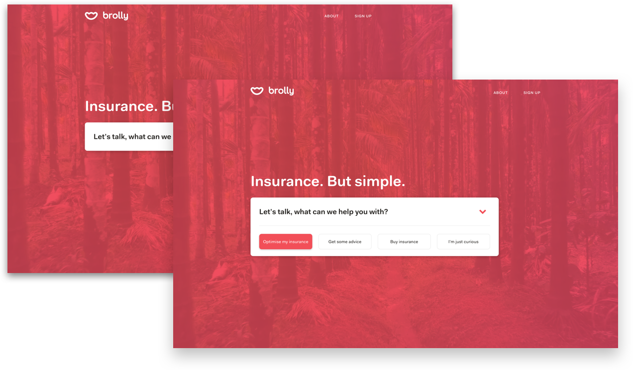
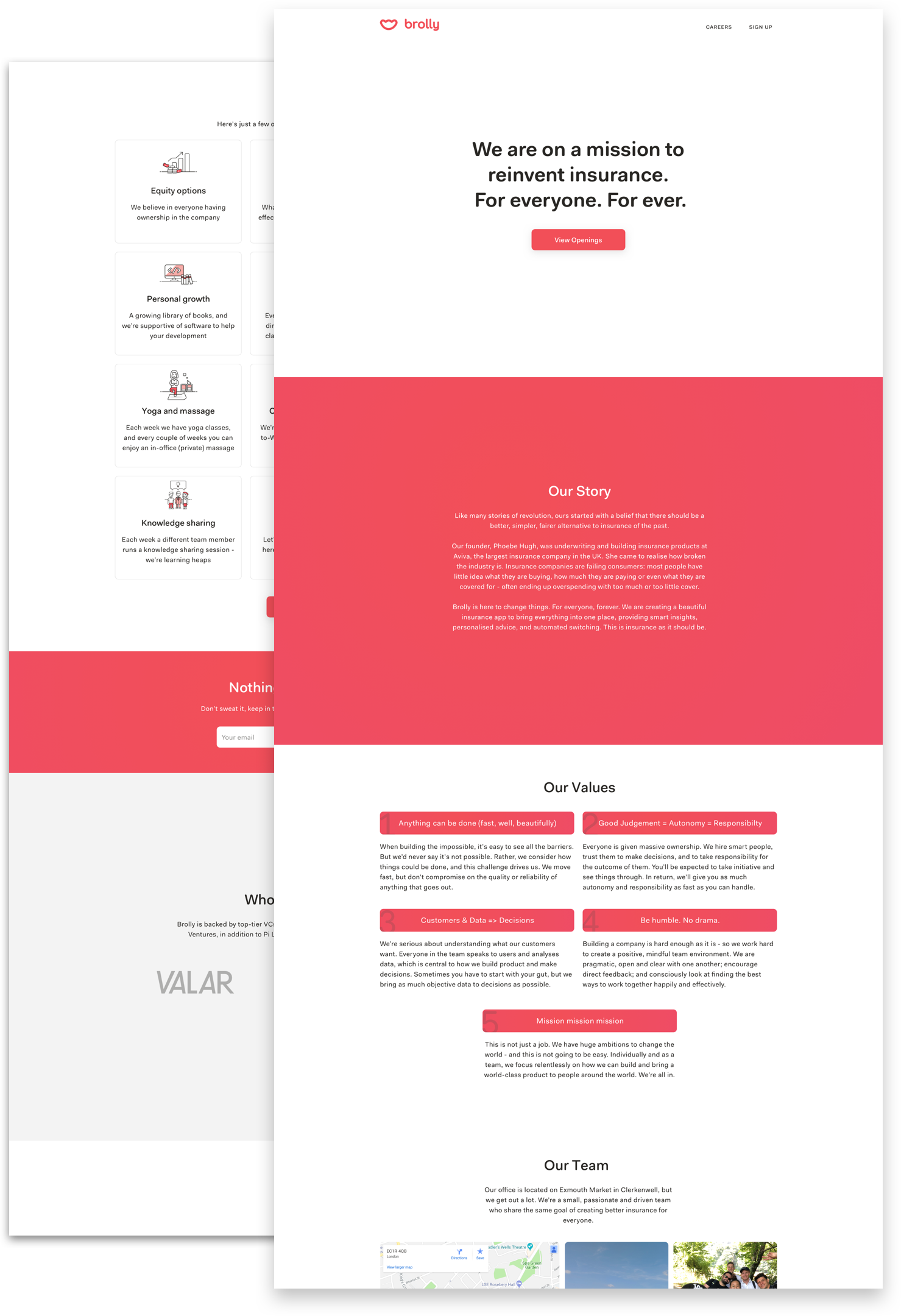
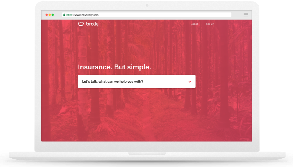
    Several months of experimentation and new product/feature launches meant that the old website was a confusing collection of different narratives and places to go. We had the web shop, insurance advisor and mobile app. The direction I decided to take with the landing page was to guide the visitor down the correct path. I also included a “Just curious” link for those who were just browsing.

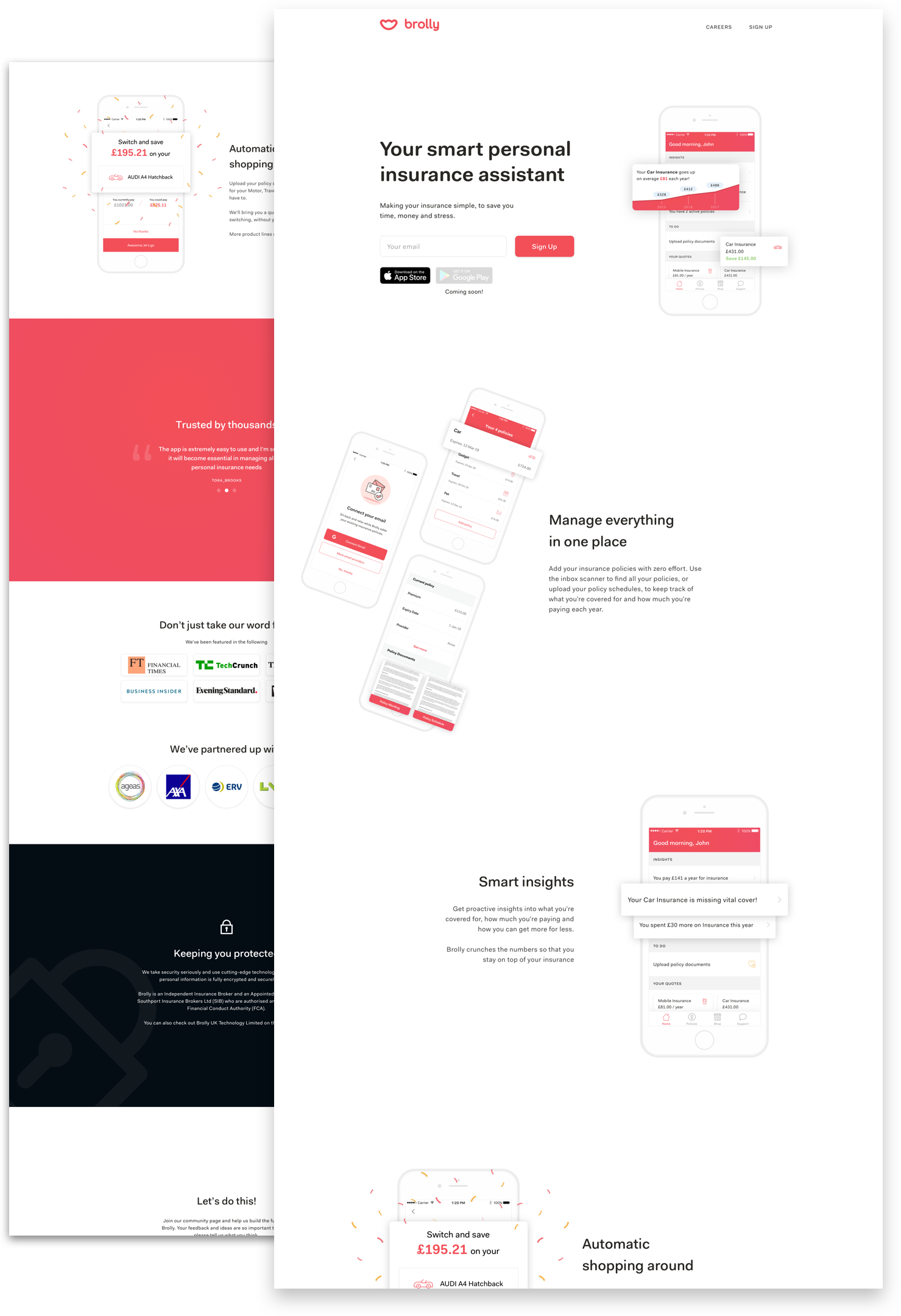
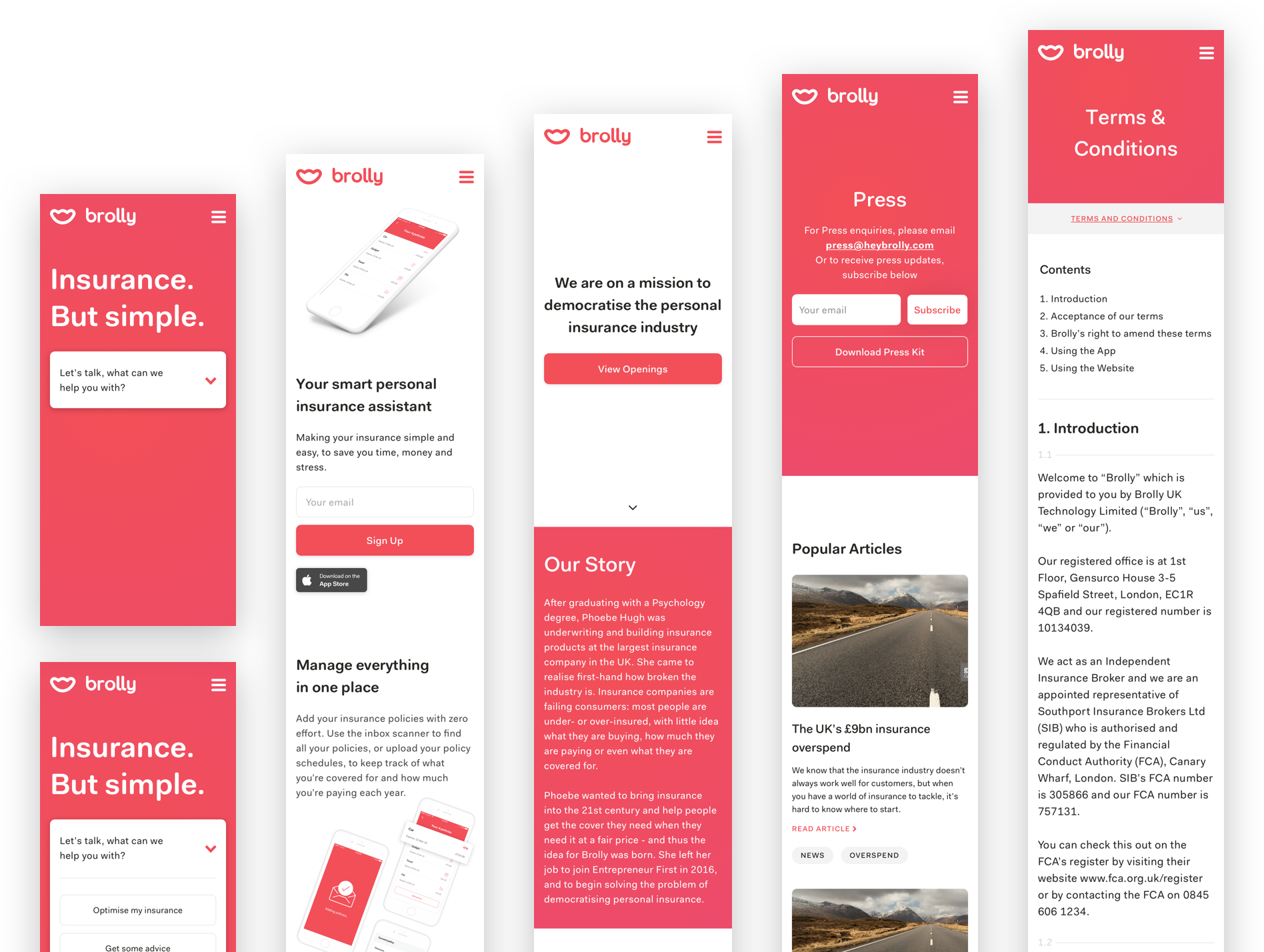
    We focused on clear simple messaging, with shots of the app to help explain functionality. We utilised large amounts of white space and kept elements purposefully separate to engage users on one piece of information and reduce cognitive load. To increase trust in the brand we included sections on security and showcased our partners.

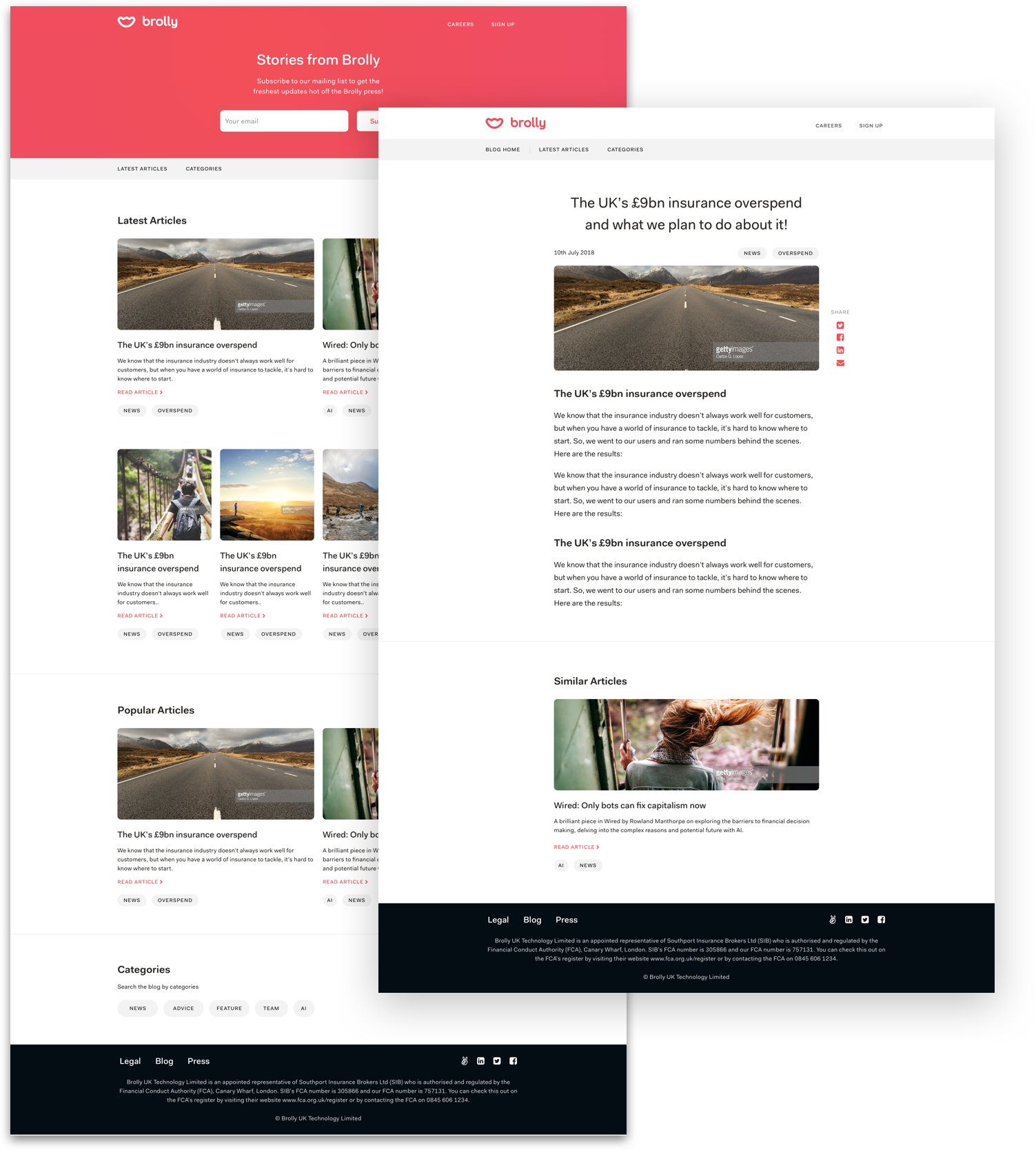
    Having a platform we could easily inform users and potential users alike of the benefits of Brolly was crucial to our growth. We separated the sections into “Latest” and “Popular” allowing constant access to the most fruitful articles. We took care not to overpopulate with too many blogs whilst also utilising element hierarchy and large images.

    Keeping consistent with principles we dictated for the homepage: clean, simple, clear. We also added some intrigue in the form of illustrated icons for each of the company perks.

    OVERVIEW

    Outcomes

    With the new website and once we launched our online shop where you could purchase travel insurance, we saw a large increase in sales through our website. So much so that it posed the problem whether we should even have an app at all or just sell via the web. We then went on to build more of our app features (like the locker) onto our web platform to test this.

    Want to learn more?

    Download my resumé