BT Group is the largest provider of fixed-line, broadband and mobile services in the UK. In 2015 they bought EE, the largest mobile operator in the UK, for £12.5billion. And then in 2019 they announced they would return to the high-street, offering services through EE retail stores. The store advisors tasked with selling BT had a slow, cumbersome platform to process orders which affected their ability to sell.
To optimise the experience for our Store Advisors so they can:
DISCOVER
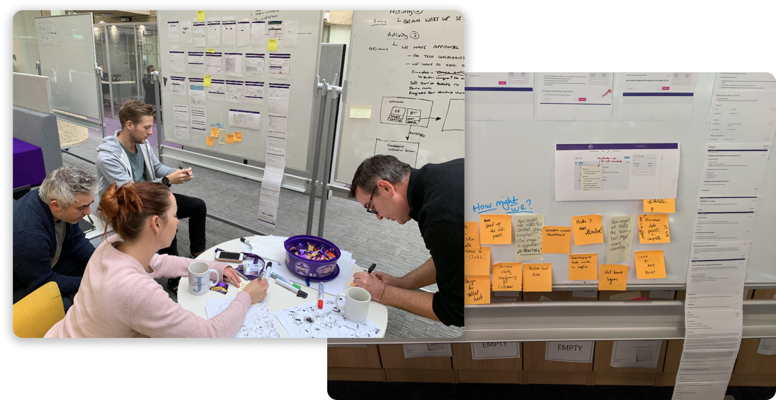
As the platform was only available on company provided tablets to the Store Advisors, we were not immediately familiar with the journey. So we printed off each step, stuck it onto a whiteboard and began to go through each step to highlight experience blockers, accessibility issues, and design problems.
DISCOVER
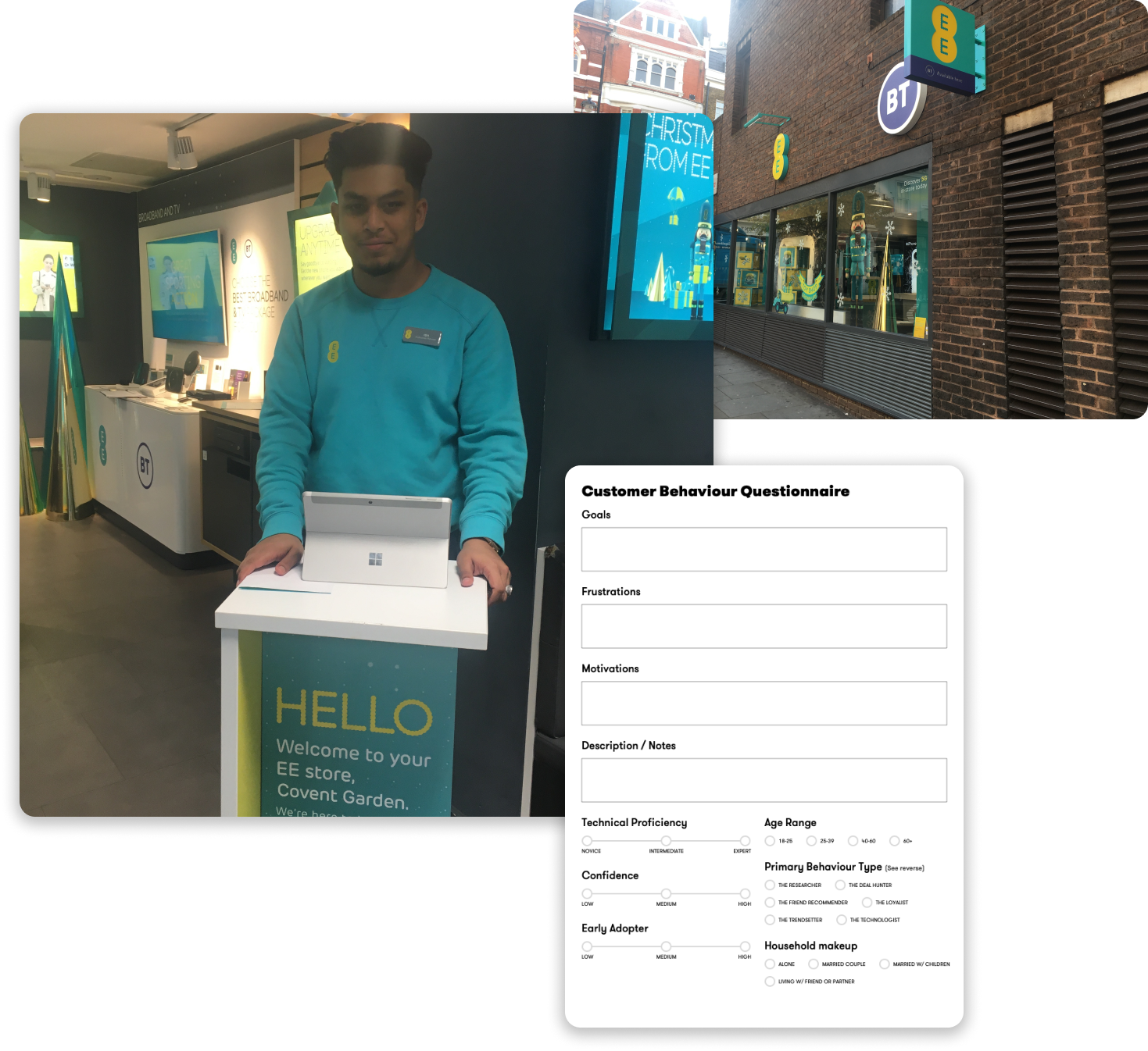
It became clear that we didn’t have much data or research to use going forward, so a key part of this project was to establish an understanding of our users’ needs and motivations. I reached out to our User Research Lead and together we visited stores and observed both the staff and the customers who came in. With a view to create personas from the information we gather. I collated the information into a spreadsheet and wrote up a report of our observations. See the observations, and spreadsheet.
DISCOVER
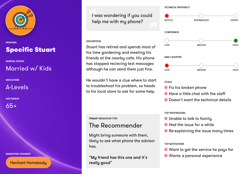
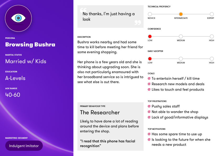
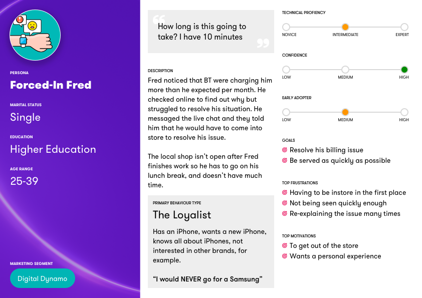
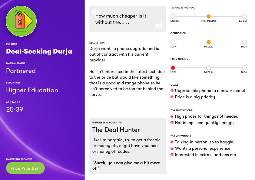
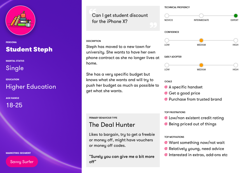
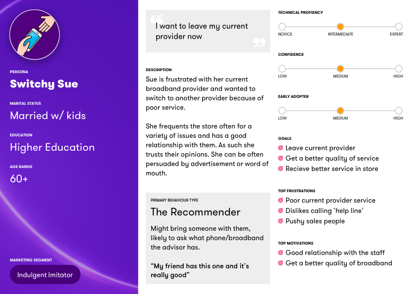
I had earlier noted that despite having personas for our online customers, we didn’t have any for in-store customers nor (importantly) our Advisors. Why is this important? Well different Advisors will have different sales styles and different needs of information.
Utilising the information gathered from our store visits I created a variety of personas. These have been popular amongst our digital team, as most Designers have found that our current personas are marketing heavy.
CREATE
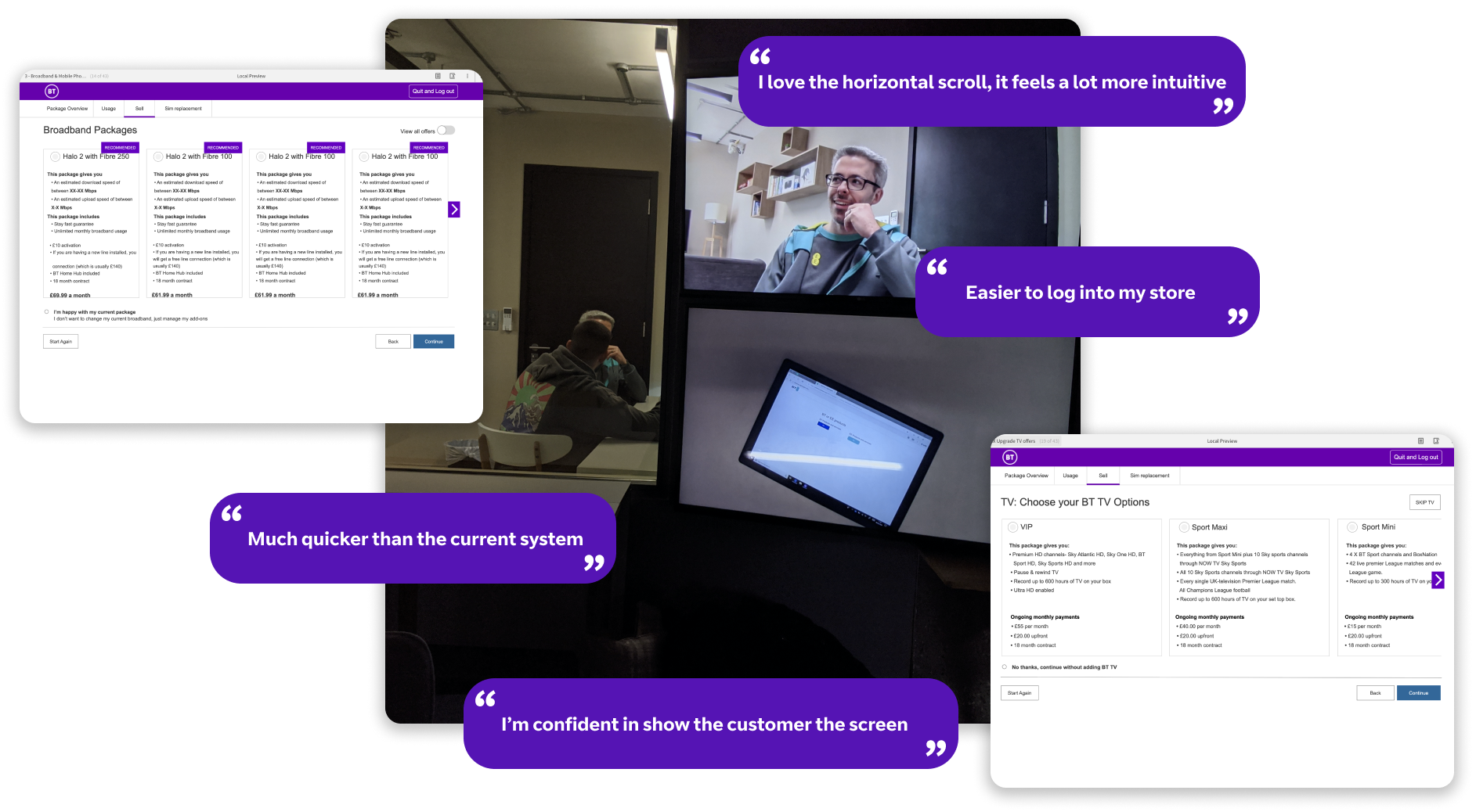
I worked within the technical constraints and utilised our existing design patterns to put together a flow in Axure. The Product Owner for this project was a former Store Manager so we got him to arrange for some Store Advisors and Managers to come to our usability lab to run through some prototypes. The feedback was positive and allowed me to iterate on my designs.
Key findings: Less information is more, the advisors are ‘super users’ so they don’t need the same info as the website. The system is slow, improving technical debt will go a long way to improving the experience. They like the tablet first approach.
CREATE
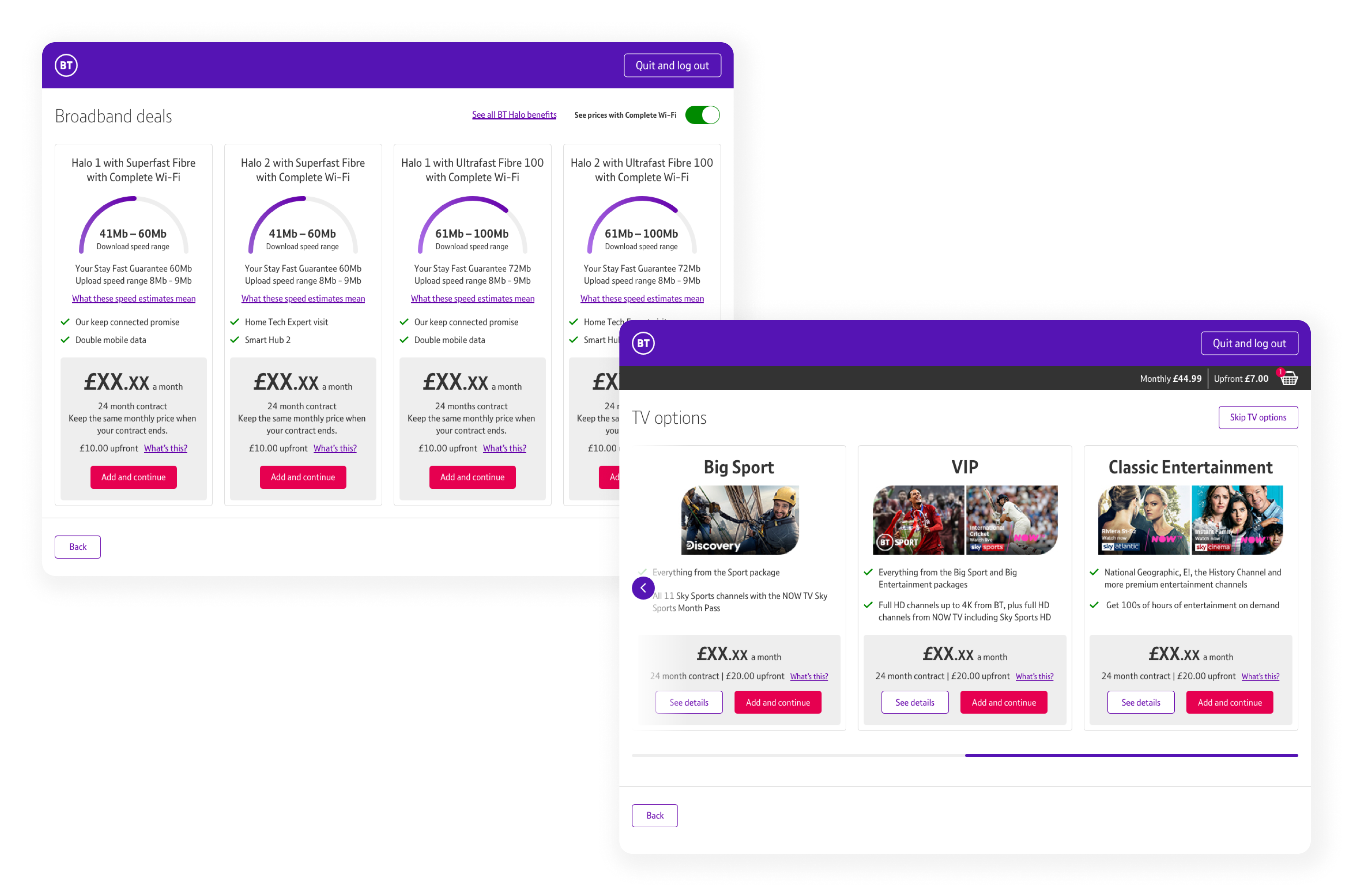
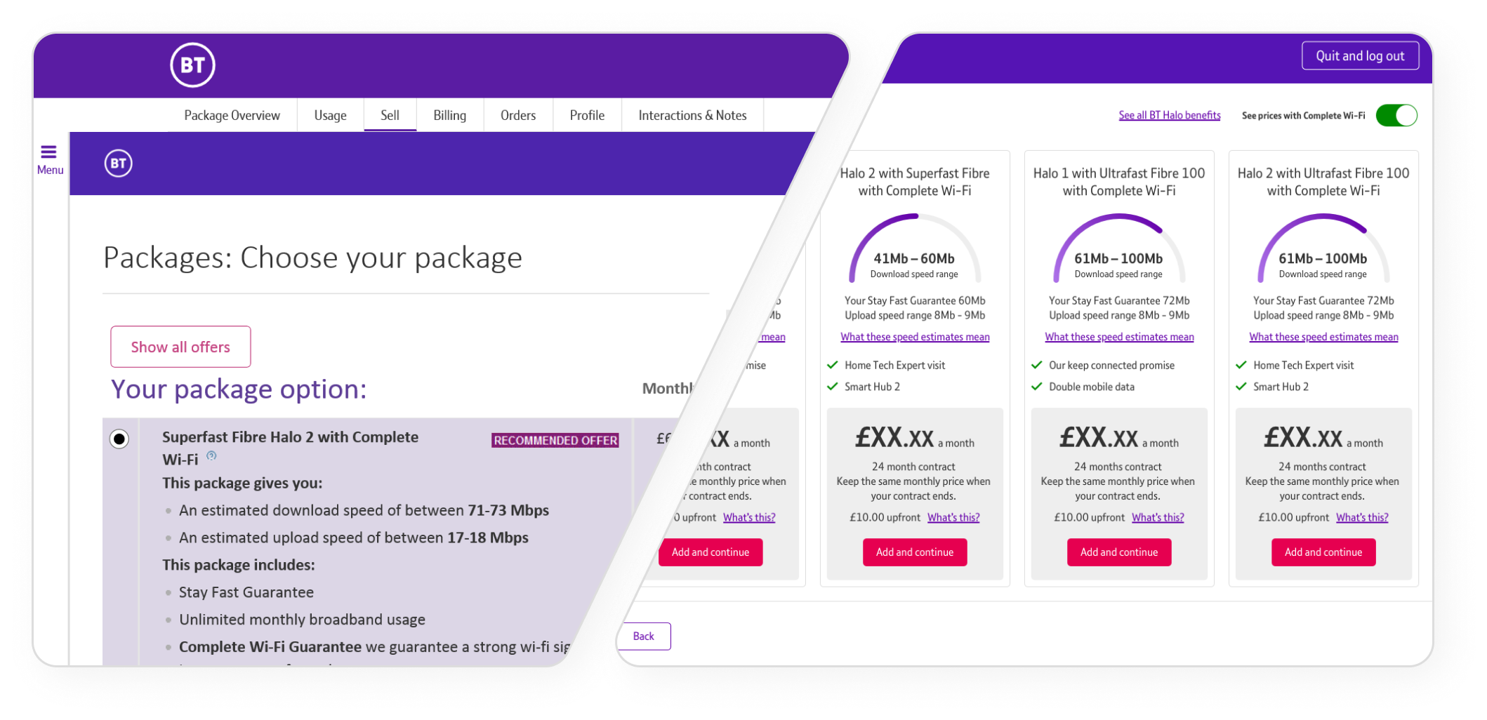
I took these learnings from my research and moved away from the old list format view. The Advisors had responded well in user testing to our horizontal cards. I took the information that we previously had under each list entry and diluted to the essentials that I’d been told were needed to proceed with a sale. This information then provided the base for each card. I liaised with other designers in the business as they were also redesigning our product listings to a card based proposition.
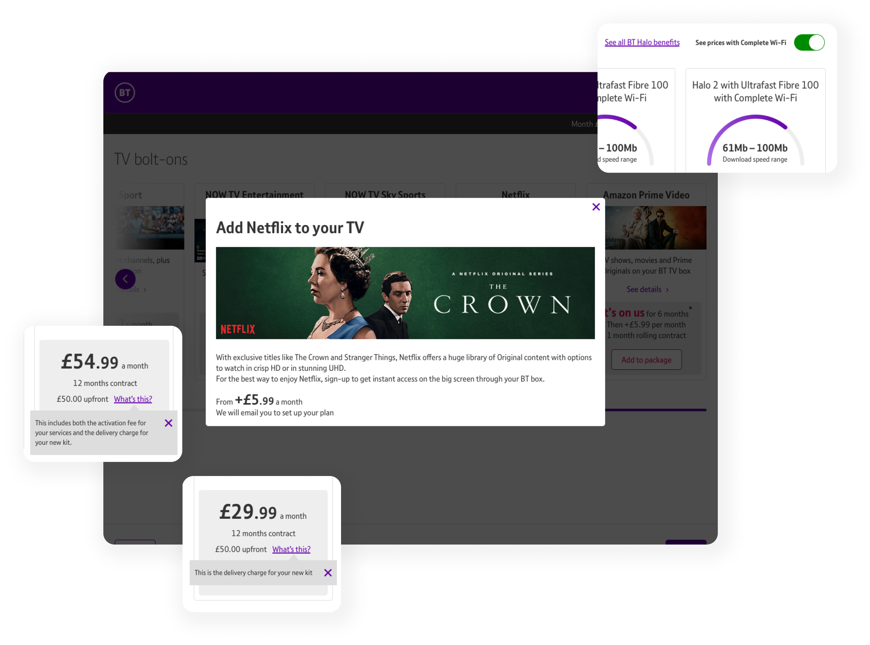
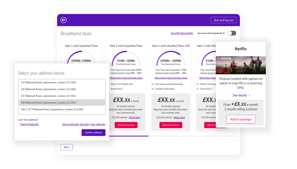
As I had removed some information from the cards, sometimes this still needed to be available for contractual reasons. So there were various ways to display the extra information. For example, our premium offering of ‘Complete Wi-Fi’ was available through a toggle, and extra information like channel listings could be accessed through a pop up.
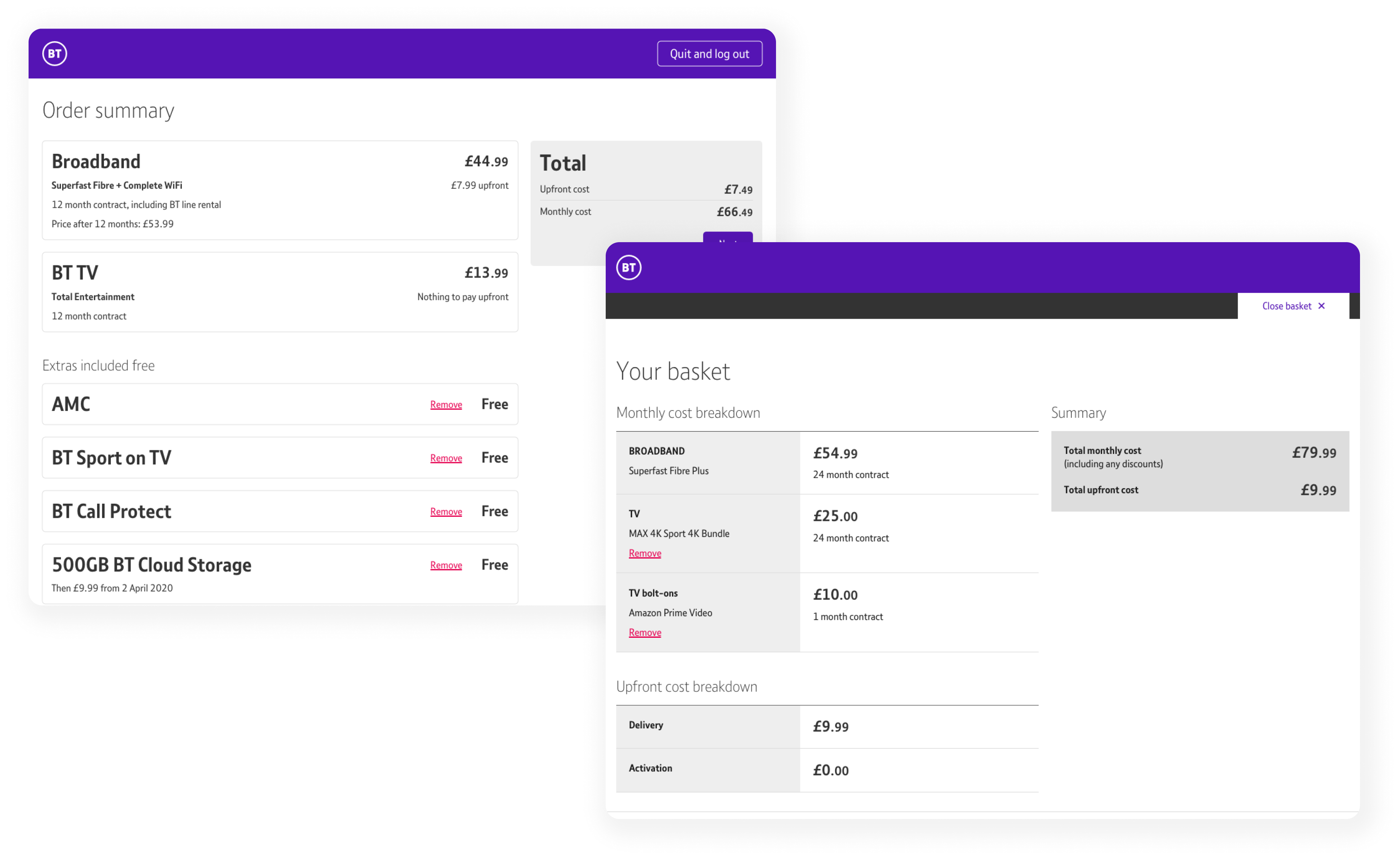
The order summary page was previously unclear and we’d received feedback that this was another stage where the Advisor would potentially show the customer the page and talk through what they’d agreed. We also introduced a basket page so that orders could be edited before reaching the final summary page.
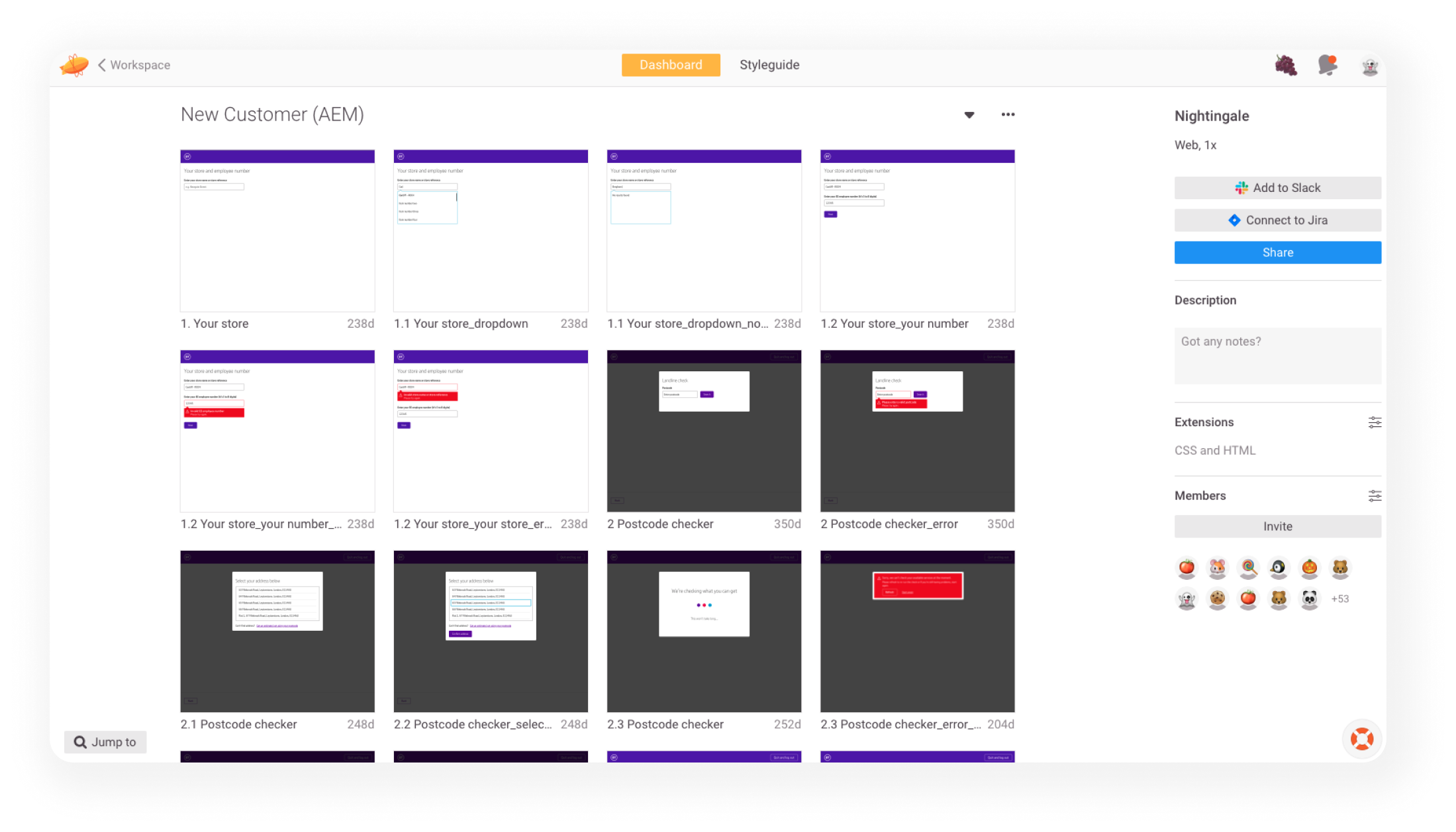
I worked very closely with our development team to ensure we provided our Store Advisors with the sales tool they needed. I used Zeplin to deliver the final visuals and assets to them as well as keeping regular dialogue open.
OVERVIEW
You can see below the obvious immediate improvement in the product selector page. By reducing the amount of screens and adding the ability to swipe through products - the advisors were much more efficient. Effectively allowing them to serve 1 - 2 more customers per day. This means an increased number of people to sell to and therefore an increased probability of a sale.