For exercises that generate real-time performance data (e.g. distance, calories burned, repetitions), many fitness classes encourage friendly competition through a digital leaderboard visible to their students for the duration of a session. I was tasked with designing a two-screen experience including a large television display for the leaderboard and a simple smartphone app for agreeing to participate and choosing a public identity.
I took this brief, applied some constraints and came up with the following Project Goal
Create a unique spin class experience that encourages friendly competition between participants utilising the class monitor and the participants phones.
APPROACH
As there was a fairly quick turnaround on this project, I thought this a great opportunity to utilise a Design Sprint - which was slightly modified to my specific needs and constraints (team of one 👋) This would enable me to work to a framework that encouraged quick experimentation and deliverables. Due to the requirement of the task needing high fidelity mocks I added an additional step - upon review this was not necessary as I just took more time on these items before validating with User Testing.
UNDERSTAND
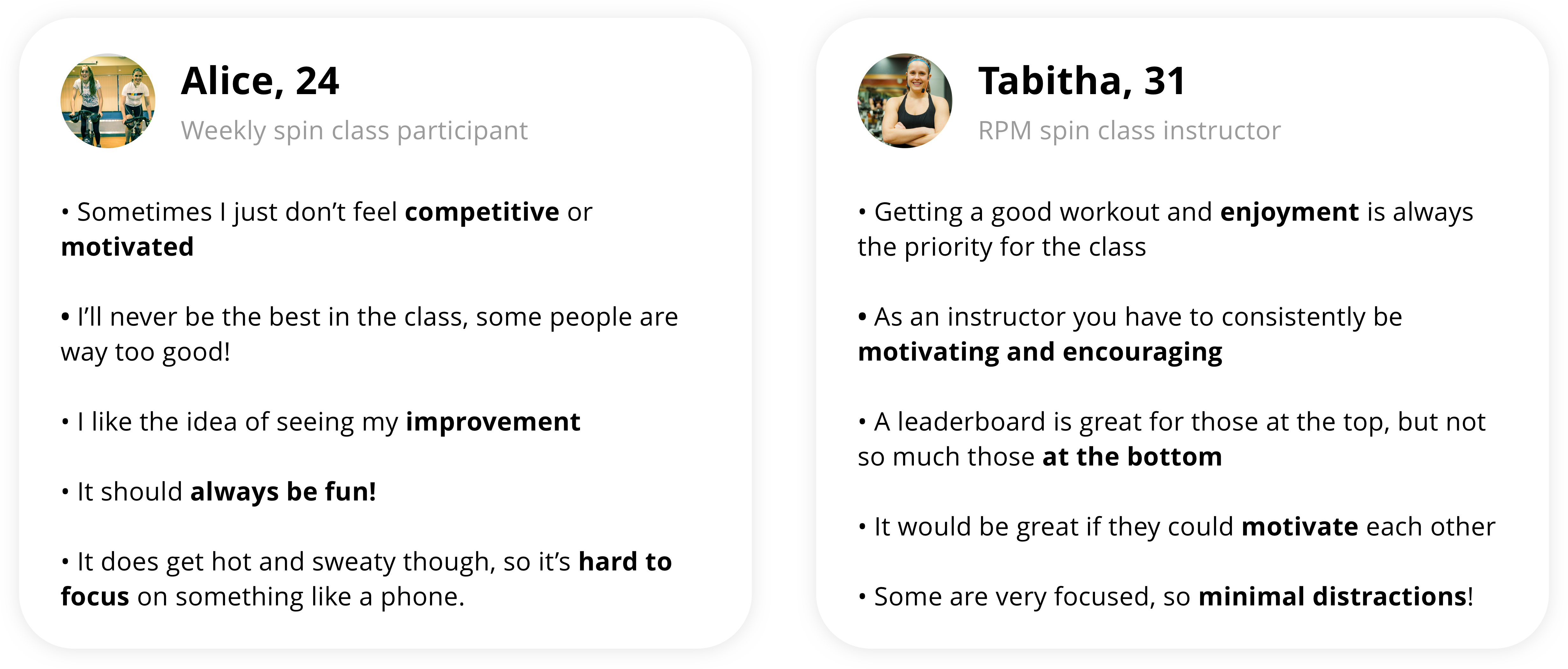
I arranged a chat with a spin class instructor through a mutual friend, and also proceeded to collect insights from friends who have attended spin classes in the past. These conversations helped to surface insights that I could incorporate into the design work and help facilitate discussion later in the project.
Key findings: A leaderboard is great for those at the top but not so great when people "aren't feeling it"
UNDERSTAND
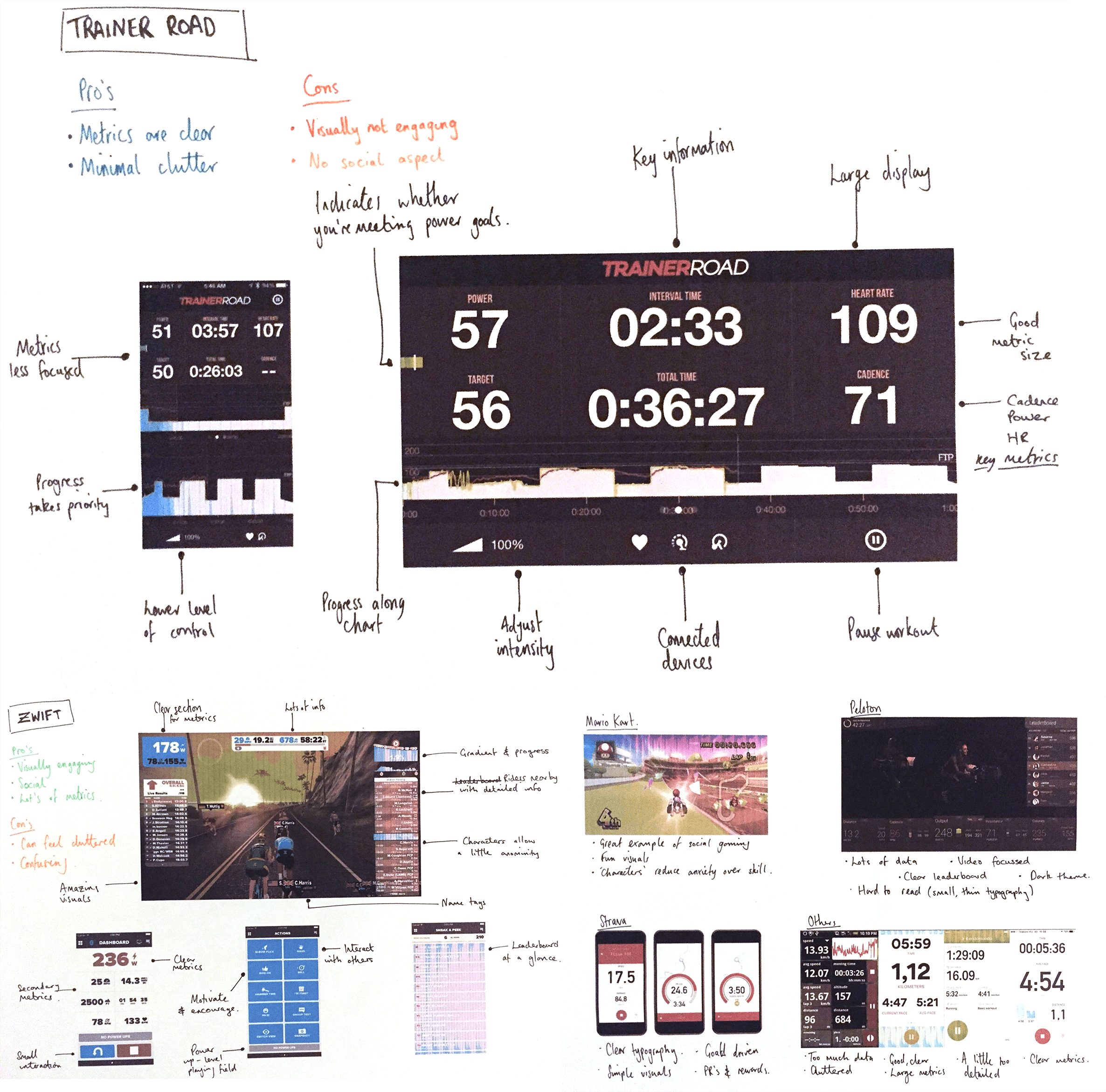
Some quick desk research was conducted doing competitor analysis of other applications that operate within a similar field, I paid particularly close attention to information structure, layout, tone and navigation.
Key findings: All competitors displayed key metrics very boldly and clearly, irrelevant of other stylistic choices
UNDERSTAND
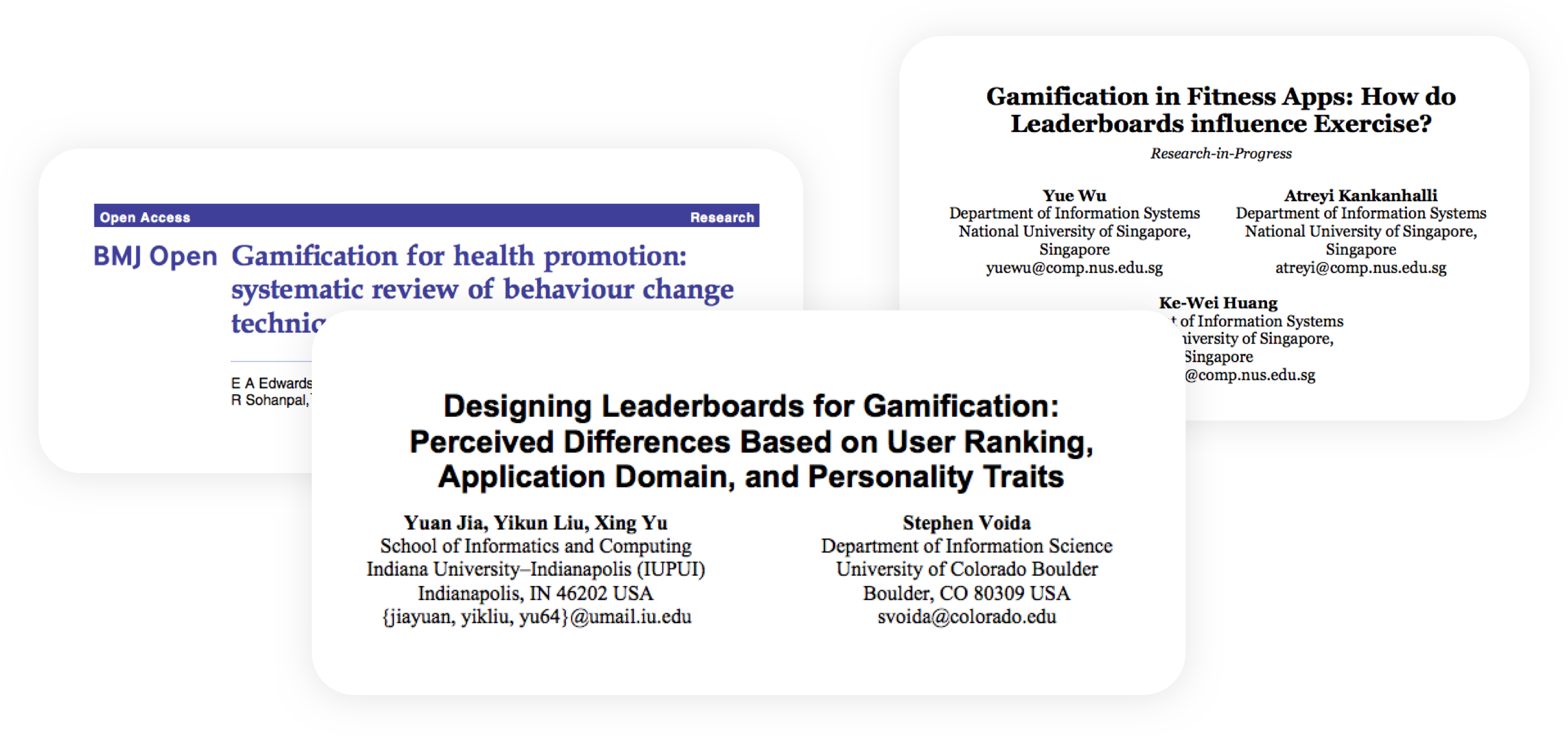
In order to attempt to replicate the Lightning Talks within a Design Sprint, I looked for some expert views on the topic that I hoped would share some insight. I then noted down some of the key insights within a brainstorm.
Key findings: Too much competition can hurt motivation and make users feel uncomfortable
DEFINE
Using the information and insights gathered at the previous steps, I utilised the ‘How Might We?’ method to fill post it notes with solutions. This is a method that involves reframing challenges as solvable questions. I even shared some of the earlier insights and encouraged others to contribute to my HMWs. After this I then created an Affinity Map to group themes and highlight areas.
Key findings: Our solution should be a fun, rewarding and motivating experience with important information clearly displayed
SKETCH
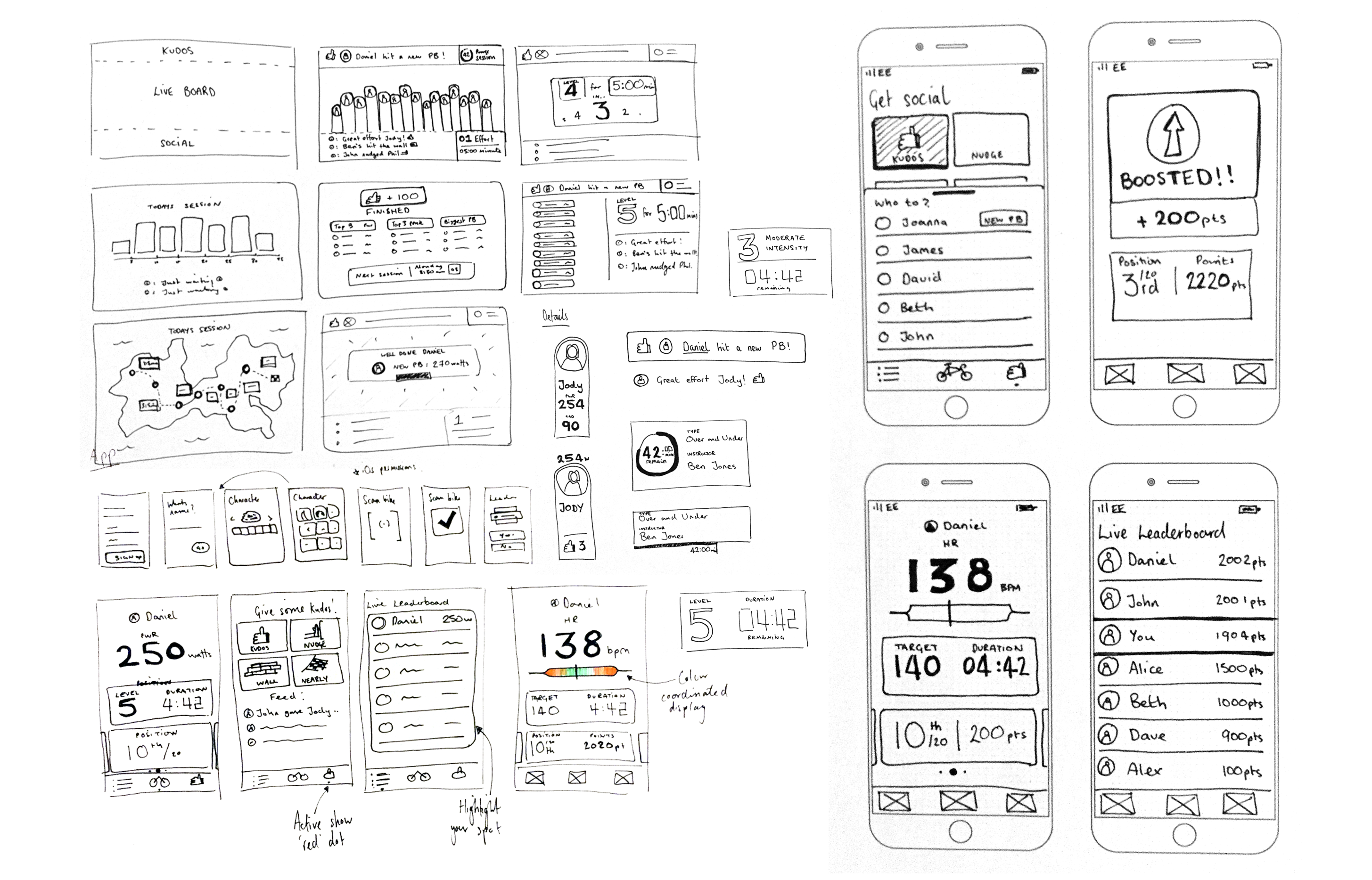
Utilising another Design Sprint tool (Crazy 8’s) I also did some exploratory sketching to delve into some of the more creative ideas I had been having - this is a great way to expand on some of the tangent themes that may have cropped up earlier. These then begin to take the shape of low fidelity wireframes.
PROTOTYPE
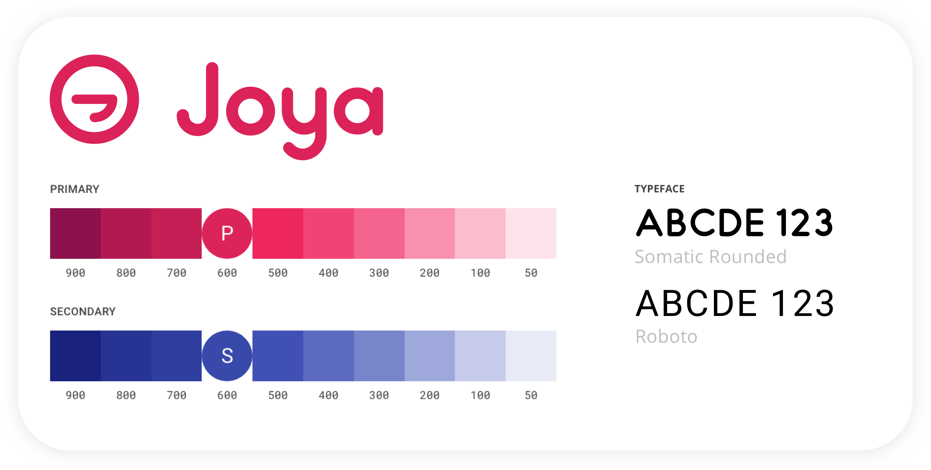
In order to create a cohesive prototype for our usability test, I decided to create a brand for the spin class app. The name “Joya” was chosen because of the various positive connotations it has across the globe, such as: Joy, Joga (Spanish for ‘to play’) and Jouer (French for ‘to play’). The branding and tone was targeted at the chosen user base and intended to be warm and playful.
PROTOTYPE
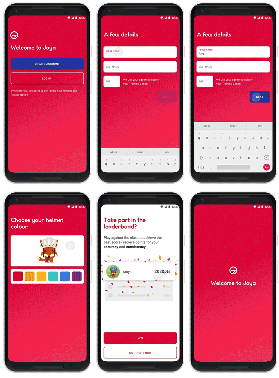
Once I felt I had explored enough UI and UX patterns through wireframing and sketching I refined the best of these ideas into high fidelity mocks. The focus with the app was to provide a fun, rewarding and useful experience. I particularly noted the research and feedback highlighting the importance of feeling comfortable in order to get the benefits of competitiveness. Utilising the avatars adds an element of playfulness and also allows the user to deflect personal negative thoughts through the avatar rather than themselves
The user must first create an account (if they’re a first time user, otherwise they log in), then they fill in their name and age. Age is important to calculate training zones for the spin session (Max HR = 220-Age)
They then proceed to create an animal avatar, this is to engage the participant in the fun and friendly environment Joya aims to create whilst also depersonalising any negative feelings
They are simply asked whether they want to join the leaderboard. Being careful to use phrases such as ‘play with’ rather than ‘compete against’
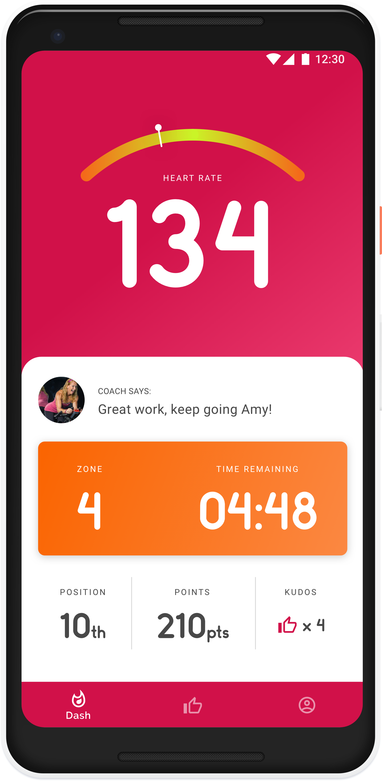
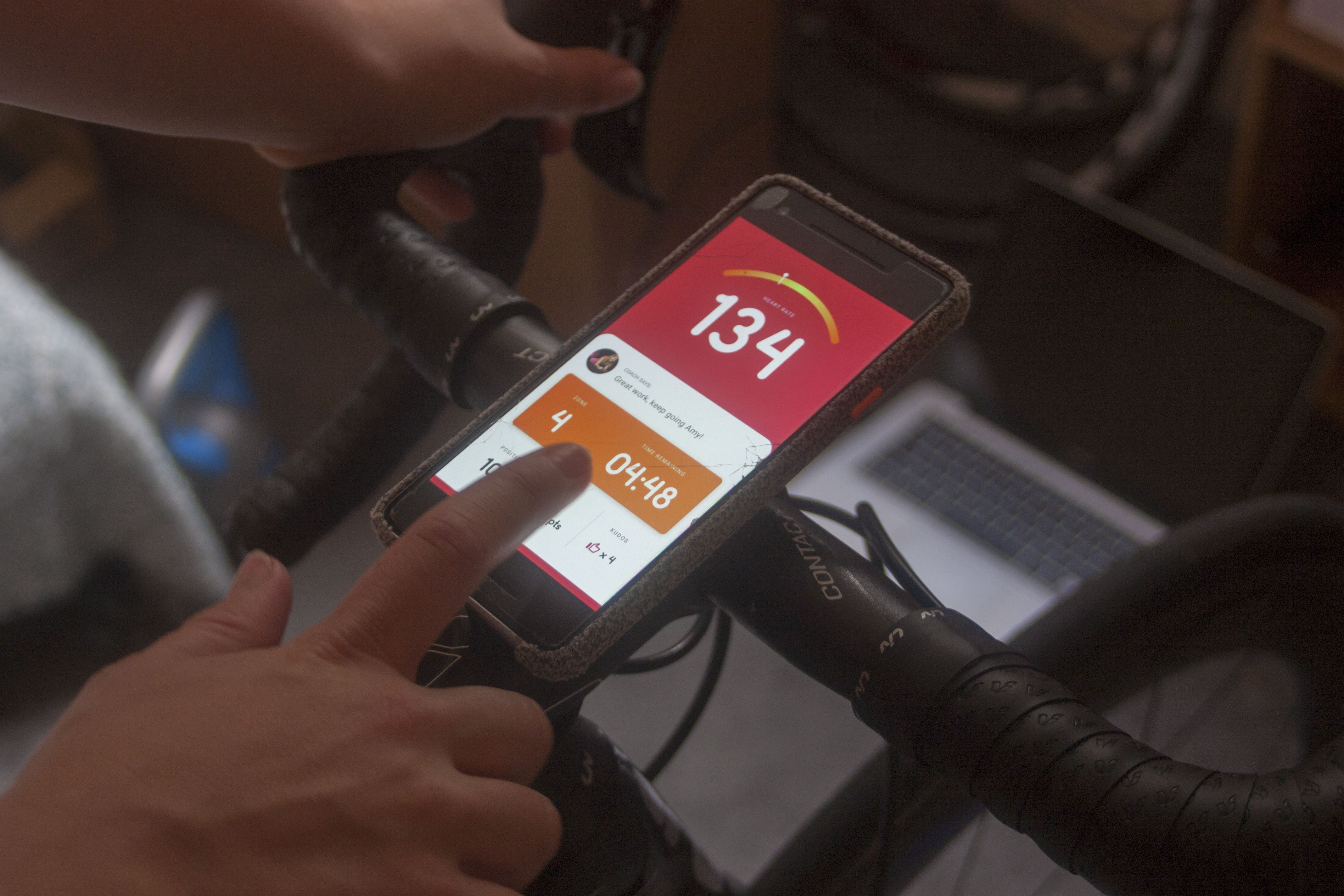
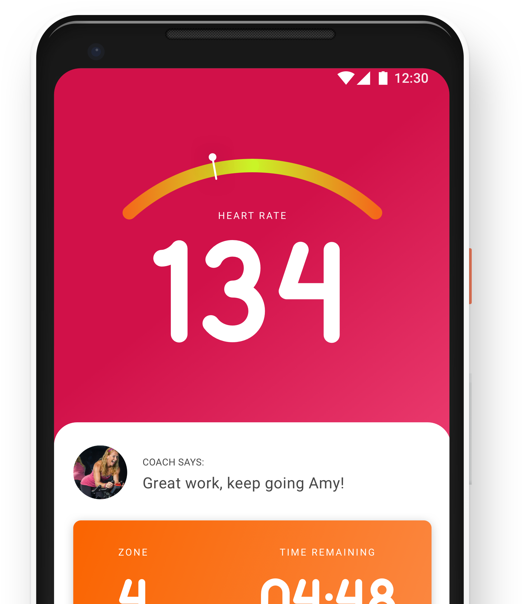
The dashboard is the main screen the user would rely on, and therefore spend the most time there
The structure of the app is based upon the key information (heart rate & accuracy bar) always being visible, so it’s only the bottom half that changes
In order to score ‘points’ the user must keep their heart rate in the target zone a.k.a the green zone of the bar
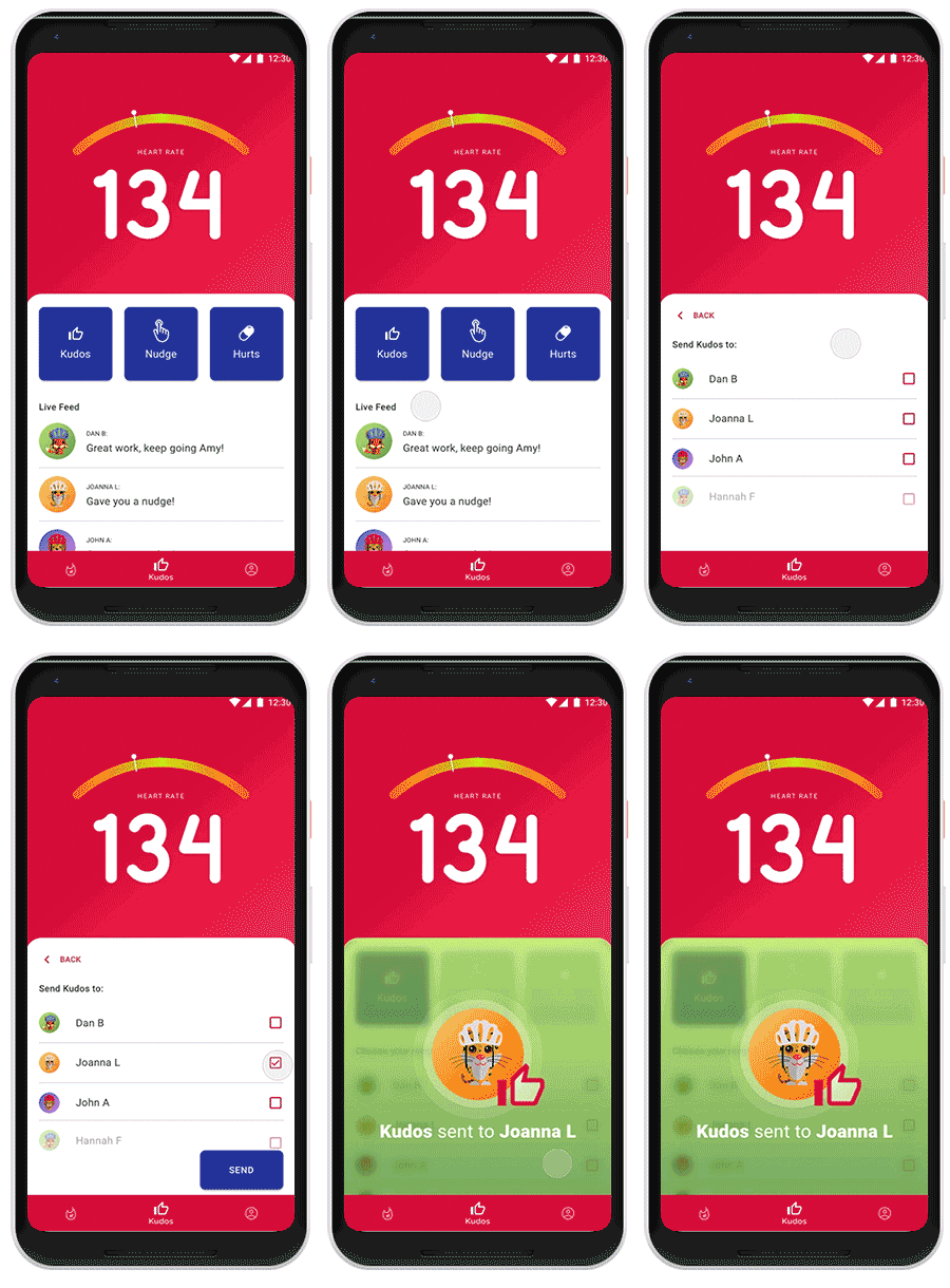
On the Kudos tab (or a swipe to the right from Dash) there a 3 clear interaction CTA’s and a short live feed of interactions in the group
From here the user can easily select an interaction, select the recipient, and send it on it’s way.
It was important for these interactions to be as delightful as possible but still constrained enough that would allow it to be used whilst cycling
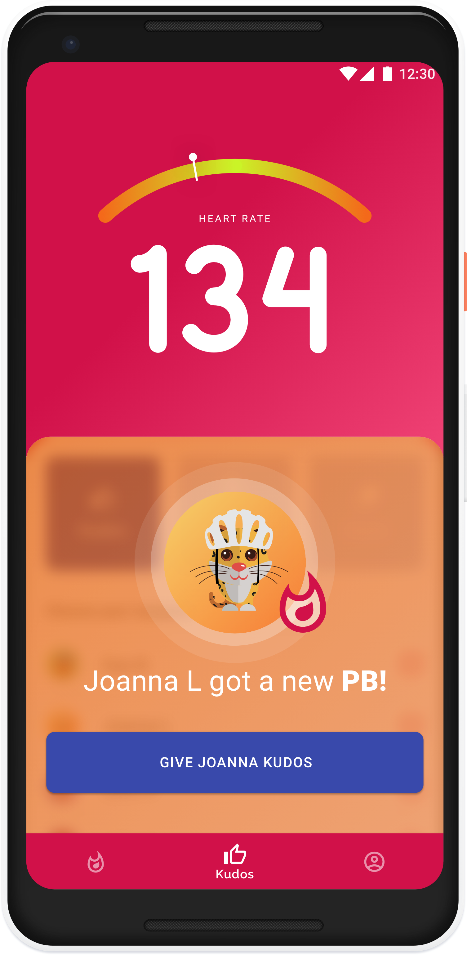
In addition to using the big screen at the front of the class, the app is useful for pushing alerts to the participants when they may not be paying full attention
If another participant gets a PB, then the alerts can be used to stoke engagement and encouragement - scientifically proven to motivate
Other alerts such as a target zone change, another participant sending you Kudos or an automated encouragement message
PROTOTYPE
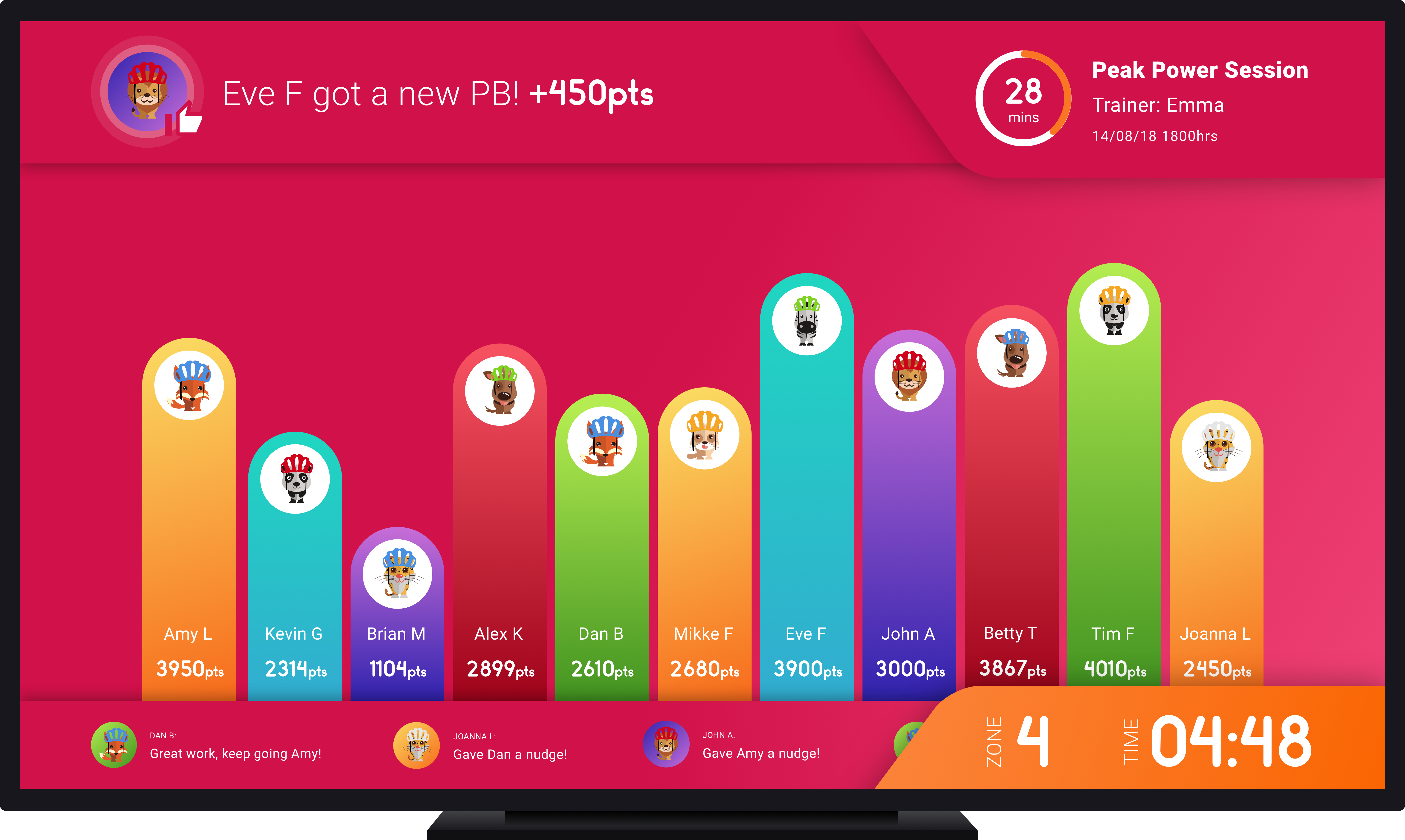
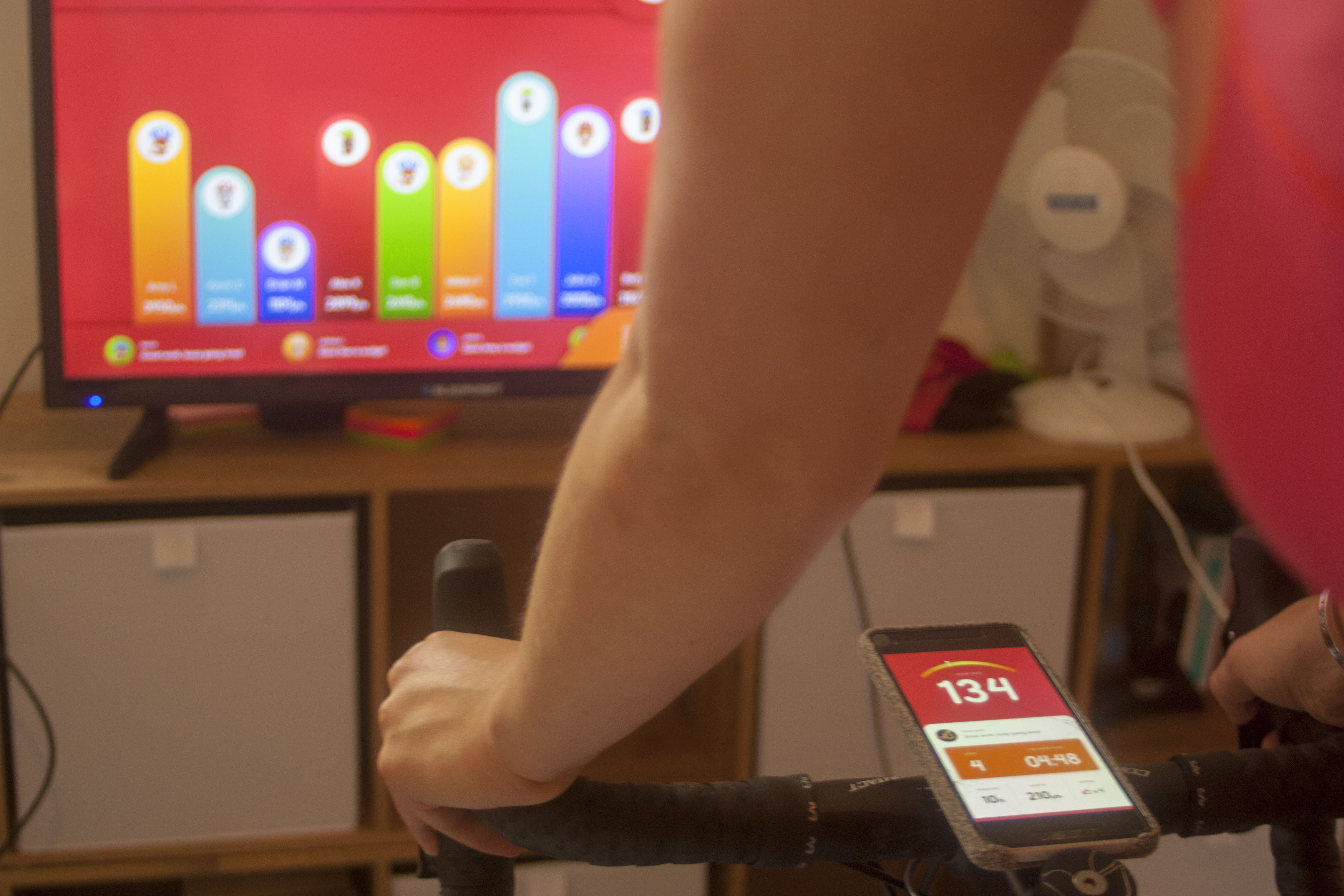
In designing the TV leaderboard there were a few technical aspects that needed to be considered: the legibility of type, contrast in different light and different viewing positions. From a user’s perspective I went for a non vertically hierarchical leaderboard, again to lessen the stress of competitiveness. It’s much harder for the user to scan across to see exactly what position they are in.
Along the bottom of the TV is the social feed, which scrolls like a ticker tape filled with encouragement and banter
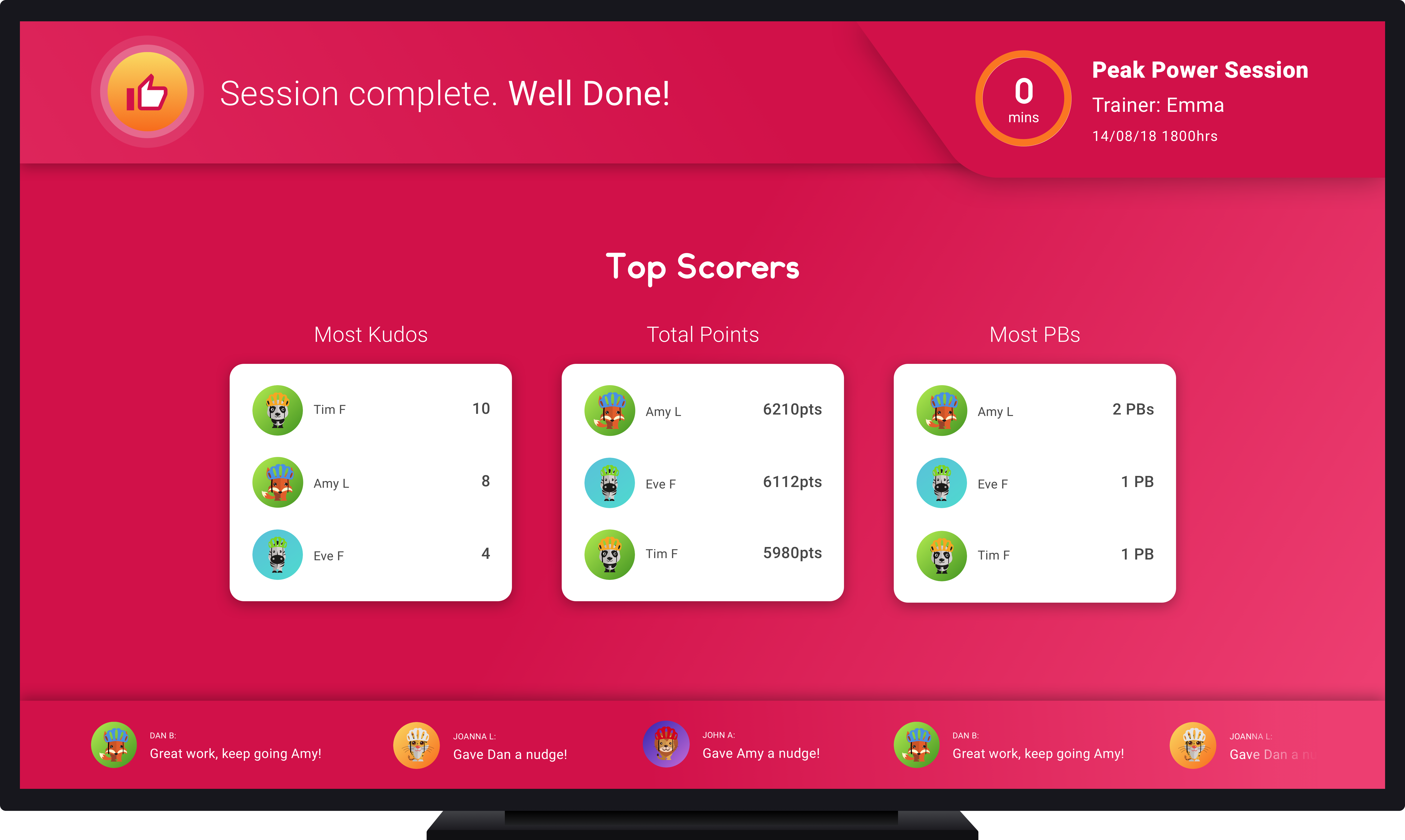
At the end of the class, there is no solitary winner - there are 3 different categories including highest points, biggest PB and most Kudos. Giving everyone the opportunity to feel as though they have achieved something in the sessions.
VALIDATE
Without having a spin class to test on, I utilised the bike trainers we have in our flat and set up a small studio. I then got the participant to cycle and interact with the app, discussing the what worked well and what didn’t with both the mobile app and the leaderboard. Below are some of the key takeaways that if I were to iterate further I would start with.
Key findings: "I love how vibrant and bright it is, really draws my attention and focus. Some of the text on the phone is a little small, I want to be able to glance down and see what people are saying or doing. I think the app could be even simpler - think about which things need to be seen during the session vs later on. Overall, I liked it!"